ServiceClick’s New Look & Feel

To help speed things along, you’ll soon be navigating ServiceClick with greater ease than ever before as a result of our ongoing user interface improvements. With this new interface, you’ll find the information you need from the system faster, get your updates done quicker and improve your overall workflow.
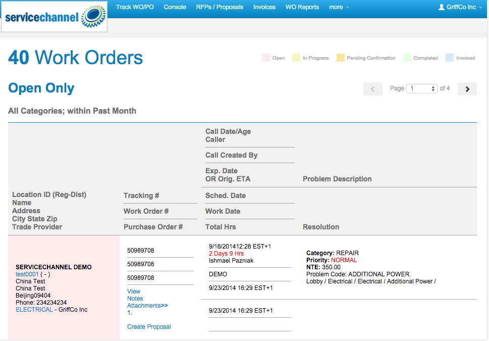
Providers Will Be Able To Easily Differentiate Between WO Statuses
We will be changing WO status colors to higher contrast on all WO reports to make it easier to distinguish between different statuses.

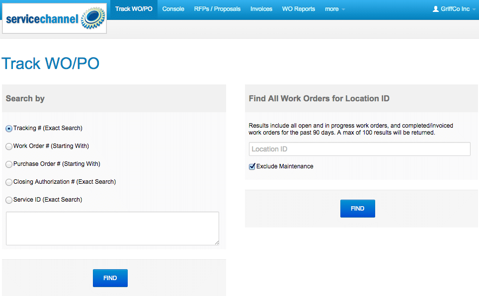
Work Order / Purchase Order Tracking
On this screen, you’ll see a more streamlined look and feel when searching for particular WOs and POs.

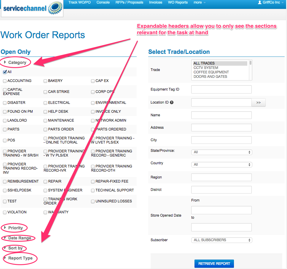
Work Order Reporting
To improve your efficiency and get you right to the particular information you’re looking for, we’ve simplified the Work Order querying screen. You’ll see that you can perform searches across any number of criteria, but we’ve collapsed some of the non-critical search criteria, making it easier to find what you use every day.

Once you submit your report query (the specifics of what you’re looking for), through either of the preceding screens, you’ll find your resulting WO Report easier to quickly scan so you can find exactly what you need to know. You’ll spend less time online, increasing your productivity.

If you have any questions about ServiceClick’s new interface, please reach out to your ServiceChannel Account Executive.


